
The Sunday Call
Hook — A tiny detail that spoke volumes
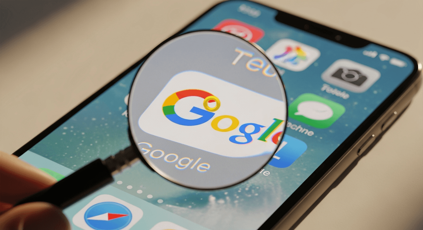
One Sunday morning in January 2008 I found myself thinking about how the smallest visual choices can carry the loudest signals. It’s a good story to tell because it captures, in a single, almost absurd moment, two kinds of power: the power of obsessive design, and the power of platforms. The anecdote is simple: the then-CEO of Apple saw a Google icon on his iPhone, decided the yellow in the second “O” was wrong, and called Google about it. That call—urgent, direct, and delivered on a Sunday—became a short folktale in tech circles about what attention to detail really looks like (Gundotra, 2011).
A note on sources up front
The core anecdote comes from Vic Gundotra’s recollection (shared publicly in 2011) and was picked up and retold across the tech press (see Gundotra’s account and later reporting by MacRumors, 9to5Google, CreativeBloq and others). I’ll mark where the story is sourced or rumored. See the sourcing note at the end for links.
Background: Jobs’ design sensibilities and why they mattered
I’ve long been fascinated by how certain leaders make design a non-negotiable. Steve Jobs’s design philosophy—minimize, perfect, iterate—wasn’t just a cosmetic taste; it was a way to think about product integrity (Isaacson, 2011). Jobs pushed teams to sweat pixels, to prefer subtraction over adornment, and to imagine the user’s first encounter as sacrosanct. For him, a product’s surface carried the moral weight of the product’s soul.
That meant color, contrast, spacing, and the tiniest gradients weren’t optional details. They were the interface between intention and perception. The stories about Jobs’ exactitude—about revising fonts, pushing back on glossiness, or insisting on specific hues—are countless because they reveal a consistent internal logic: the visual leads the tactile and the operational.
Background: Google’s early logo and the era of pre-App Store icons
Google in the mid-2000s was evolving fast. Its brand—the playful, primary-color wordmark—was iconic on the web, but mobile screens were an emerging battleground. In 2008 the iPhone experience was still nascent (this was before the App Store in its modern form), and web clips or home-screen icons were how web services appeared on phones.
Those tiny icons lived at the mercy of displays, rendering pipelines, and developer choices. A gradient that looked fine on a desktop monitor could look muddy or off on an iPhone screen. So when Apple shipped early iPhone software, it also shaped how third-party imagery would read at small sizes and on specific hardware.
The anecdote: the Sunday call, retold (what is sourced and what’s rumored)
According to Vic Gundotra’s public account (Gundotra, 2011), he was in religious services when an unknown caller couldn’t reach him. He later discovered the voicemail: the caller asked him to call back. When Gundotra returned the call, the conversation began lightly—Jobs joked about caller ID—and then pivoted to something obsessive: the Google icon on the iPhone. Jobs reportedly said the second “O” didn’t have the right yellow gradient. “It’s just wrong,” he told Gundotra, and added that he’d assigned Greg Christie to help fix it; later the subject line “Icon Ambulance” appeared in follow-up mail.
That account is Gundotra’s firsthand recollection and is the best primary source we have. Journalistic retellings (MacRumors, 9to5Google, CreativeBloq) reproduce Gundotra’s post and add context about iPhone-era UI conventions. There’s no competing primary account that contradicts Gundotra’s version; what we should treat as “rumor” rather than established fact are the private tone, intent, or any motives beyond what Gundotra reported.
Why Jobs might have thought the logo was “just wrong” — a design analysis
If you peel back the humor in the anecdote there are concrete design reasons that make Jobs’ reaction comprehensible:
Visual hierarchy and legibility: At small sizes, color contrast is everything. Yellow, particularly when used in a small, saturated glyph against a white or light background, can disappear or appear desaturated. A slight shift in gradient can change perceived brightness and legibility.
Color fidelity across devices: Displays then (and sometimes even now) varied in gamma, color gamut, and calibration. Jobs wasn’t critiquing Google’s brand on paper—he was critiquing how the rendering appeared on Apple’s device. That meant the icon had to be optimized to the hardware Apple controlled.
Consistency with system aesthetics: Apple pushed toward a coherent visual system. An icon that felt “off” against that system created cognitive friction. For someone who saw the device as a singular experience, an inconsistent icon wasn’t merely an aesthetic nitpick, it was a disruption of the whole.
The semiotics of brand versus interface: Brands are resilient, but their interface representations are negotiable. Jobs knew that the same brand could look authoritative or amateur based on how it was presented on-device. Fixing the gradient was an intervention to preserve perceived value.
In short: calling a competitor about a gradient isn’t mere arrogance. It’s an expression of a design leadership model that prioritizes every point of contact with the user.
Impact and significance: what this exchange says about tech culture
Why has this tiny story traveled so well? Because it crystallizes several tensions in modern tech:
Leadership by detail: The anecdote became shorthand for the idea that great product leaders sweat details others dismiss.
Platform stewardship: Companies that control platforms can—and often do—shape how other brands appear within them. That power has design, business, and political implications.
The narrative of rivalry and respect: For many observers, the story reads as both a power move and a compliment—Jobs cared enough to intervene, and Google obliged. It’s an artifact of a time when Apple and Google were partners and competitors in uneasy balance.
Design as persuasion: The small tweak became symbolic of the belief that visuals persuade users in ways that specifications and features can’t.
This isn’t just a cute tale for designers; it’s a useful parable about how ecosystems enforce standards and how attention transforms the mundane into meaning.
Conclusion — A note on seeing the details
I tell this story not to idolize a personality but to underline a practice: paying attention to the small things changes the conversation about what products are. Details like a yellow gradient are entry points into larger debates about craft, control, and the ethics of platform design.
Whether you think the call was bossy, charming, or quintessentially Jobs, I hope the anecdote nudges you to notice the way a tiny visual decision can ripple through perception, brand equity, and culture.
Sourcing note
Primary source: Vic Gundotra’s recounting of the event (shared publicly in 2011) and contemporaneous coverage by technology press, including MacRumors, 9to5Google, CreativeBloq, CBS News, and others. For context on Jobs’ approach to design, see Walter Isaacson’s biography of Steve Jobs (Isaacson, 2011). Specific links: Gundotra (2011) via Google+ (reposted across tech sites), MacRumors (2011), 9to5Google (2011), CreativeBloq (2024).
Regards,
Hemen Parekh
Any questions / doubts / clarifications regarding this blog? Just ask (by typing or talking) my Virtual Avatar on the website embedded below. Then "Share" that to your friend on WhatsApp.
Get correct answer to any question asked by Shri Amitabh Bachchan on Kaun Banega Crorepati, faster than any contestant
Hello Candidates :
- For UPSC – IAS – IPS – IFS etc., exams, you must prepare to answer, essay type questions which test your General Knowledge / Sensitivity of current events
- If you have read this blog carefully , you should be able to answer the following question:
- Need help ? No problem . Following are two AI AGENTS where we have PRE-LOADED this question in their respective Question Boxes . All that you have to do is just click SUBMIT
- www.HemenParekh.ai { a SLM , powered by my own Digital Content of more than 50,000 + documents, written by me over past 60 years of my professional career }
- www.IndiaAGI.ai { a consortium of 3 LLMs which debate and deliver a CONSENSUS answer – and each gives its own answer as well ! }
- It is up to you to decide which answer is more comprehensive / nuanced ( For sheer amazement, click both SUBMIT buttons quickly, one after another ) Then share any answer with yourself / your friends ( using WhatsApp / Email ). Nothing stops you from submitting ( just copy / paste from your resource ), all those questions from last year’s UPSC exam paper as well !
- May be there are other online resources which too provide you answers to UPSC “ General Knowledge “ questions but only I provide you in 26 languages !


No comments:
Post a Comment